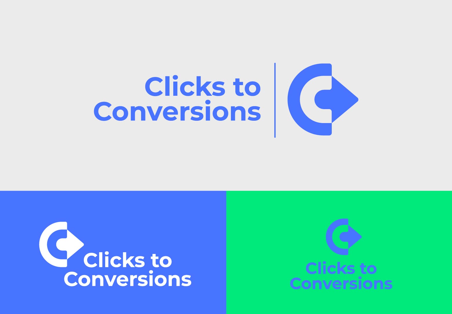
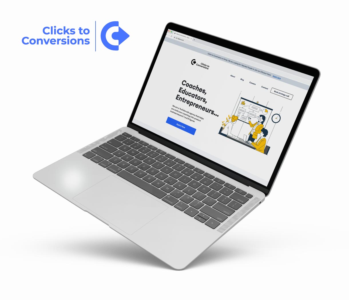
We crafted this logo ingeniously from the letter 'C' signifying Clicks, and the cursor (simultaneously portraying a 'click'). The negative space intriguingly morphs into the 'C' symbolizing Conversions. The resultant logo dons an enigmatic, almost iconic aura, rendering it effortlessly adaptable across all conceivable platforms. A color palette, reminiscent of a purplish electric blue, unfurls, embodying a contemporary digital essence with a striking visual impact on the web canvas. With a versatile nature, the logo asserts itself both in tandem with and independently of the accompanying typeface. Additionally, we also designed a clean and minimal website for "Clicks to Conversions".