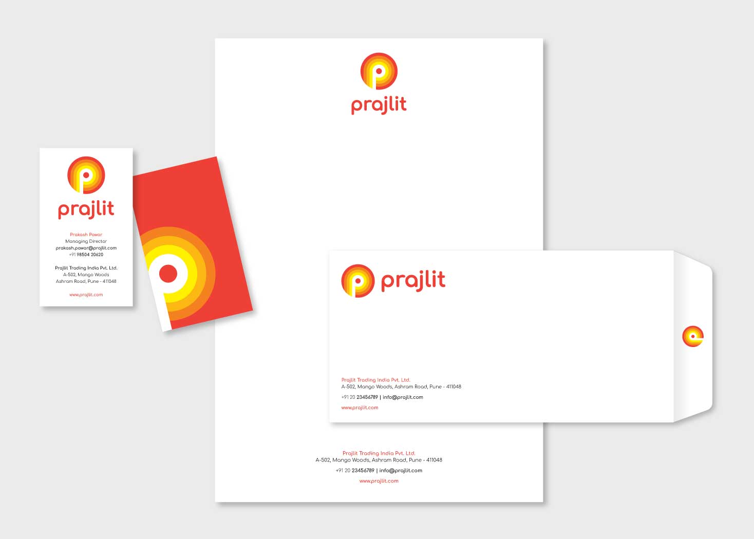
When tasked with creating a distinctive logo for Prajlit, a prominent FMCG wholesaler, we delved into the essence of their name - 'lit up'. This served as our guiding light in conceptualizing a design that truly illuminated their brand identity. Drawing inspiration from the sun, the universal symbol of illumination and energy, we seamlessly integrated it around the letter 'P' in the logo.
The circular arrangement of varying hues of yellow and orange emanating from the letter 'P' not only forms a visually captivating sun but also embodies the radiance and vitality that Prajlit brings to the FMCG wholesale industry. The choice of colors was deliberate; shades of yellow and orange are not only synonymous with the sun but also evoke feelings of optimism, vibrancy, and warmth.
Just as the sun's rays reach every corner, our logo encapsulates the brand's promise to light up their client's experience, spreading their influence far and wide. This design encapsulates the essence of Prajlit's commitment to illuminating their client's path through the FMCG market, providing clarity, growth, and brilliance.
In crafting this logo, we meticulously merged creativity with symbolism, resulting in a visual identity that goes beyond the surface, echoing the brand's core values and aspirations. Through the sun-kissed hues and the dynamic interplay of light and shadow, we've captured Prajlit's radiant journey, where every beam of their endeavor ignites success.