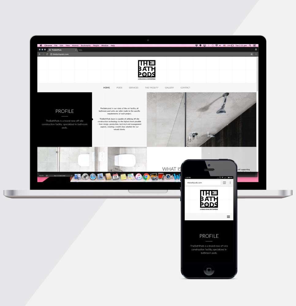
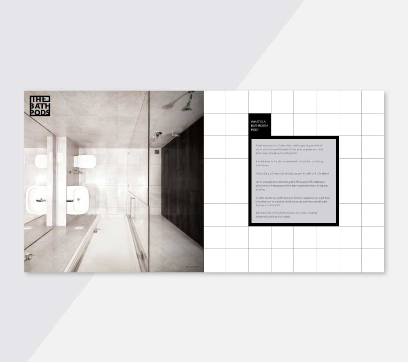
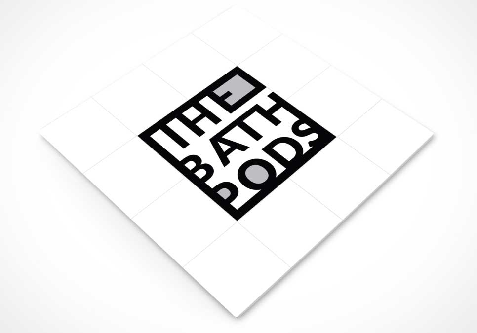
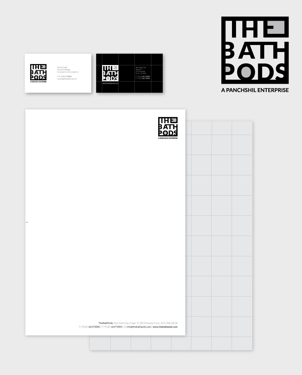
"The Bath Pods" was a breakthrough of its time, pioneered by Panchshil Realty, we were tasked with designing its logo, brochure, and website. The concept revolved around the fundamental elements of a bathroom, resulting in a brilliant visual blueprint that elegantly outlined the three core spaces within it. To achieve this, the letters 'E', 'P', and 'O' were artfully manipulated and integrated to represent the distinct areas within a bathroom viz shower area, basin, and commode. The careful alignment of these counter forms produced a square-shaped logo, reminiscent of a tile, symbolizing perfection and precision that resonated with the client's vision. A minimalist approach was taken, employing a monochromatic palette of black and grey. This deliberate choice of colours conveyed simplicity and sophistication while ensuring that the logo didn't distract from its core message.