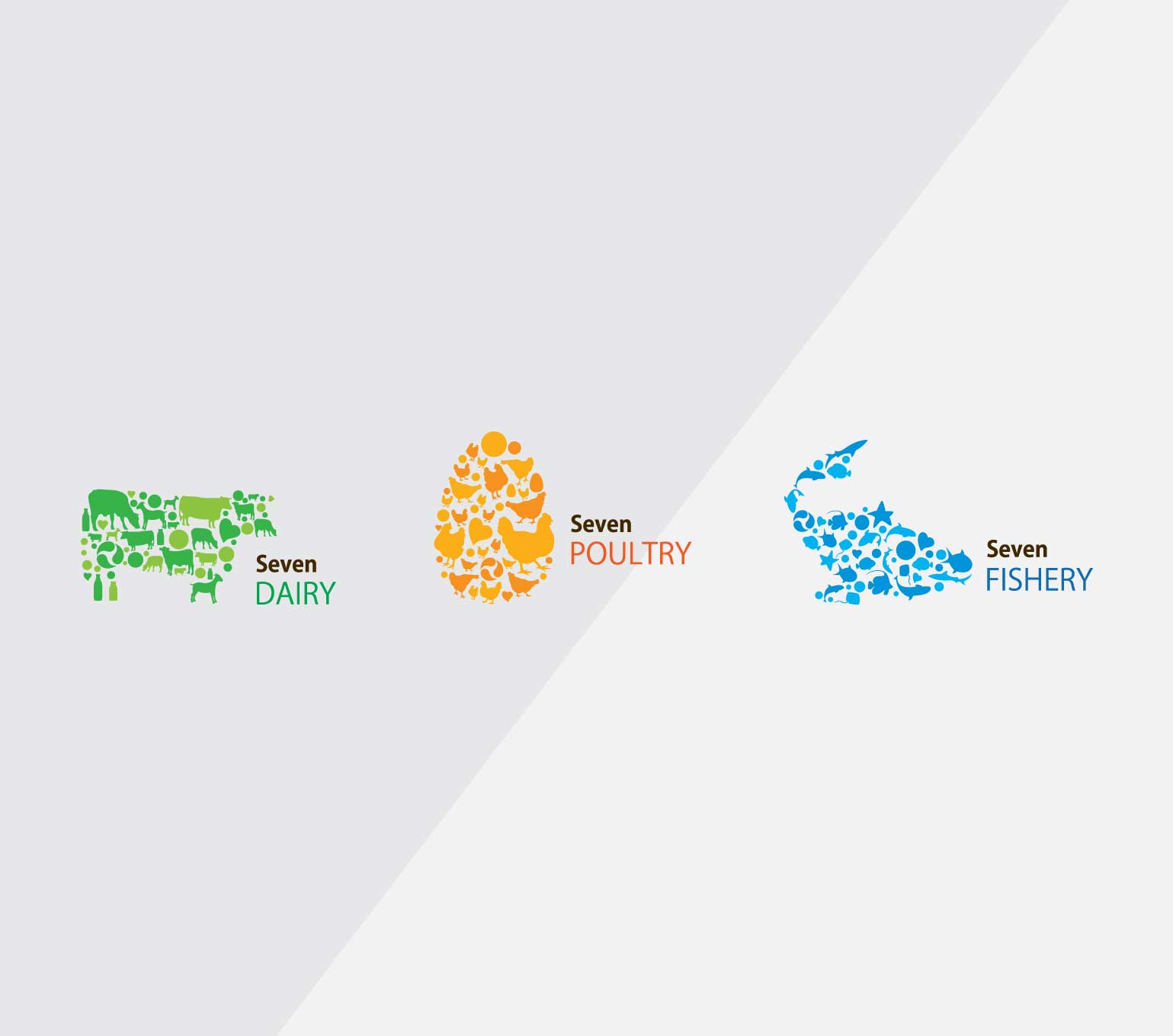
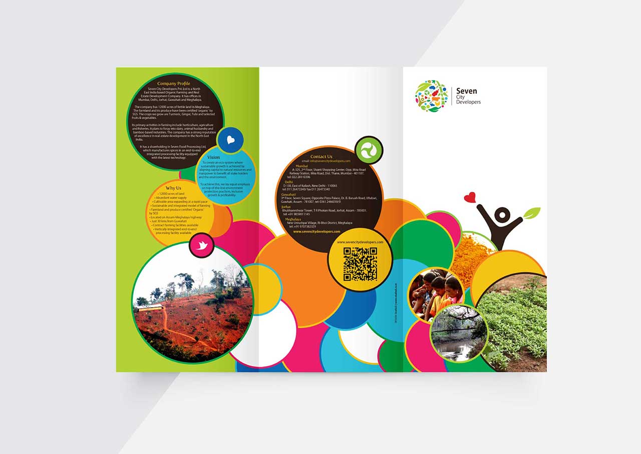
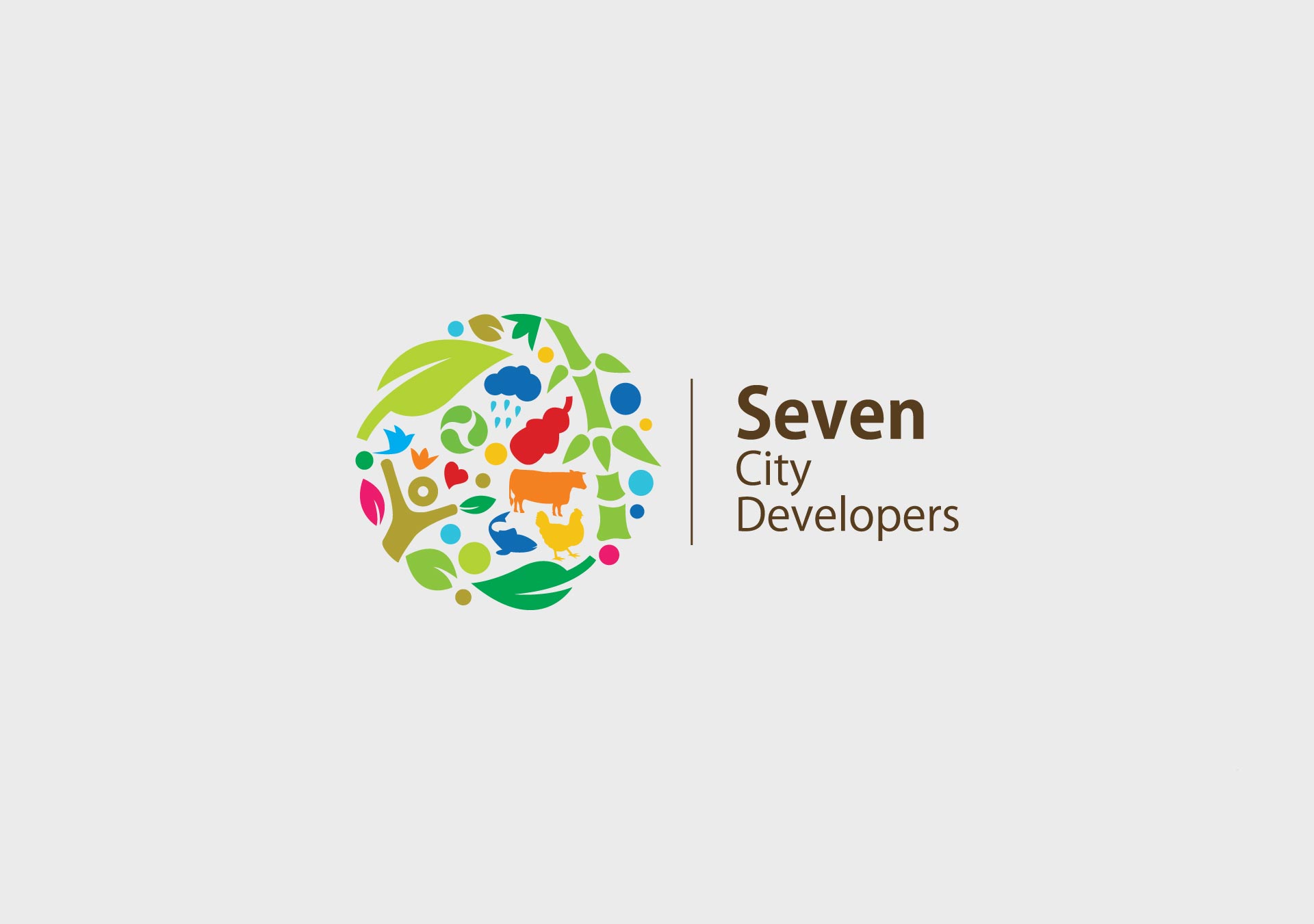
The logo design for the parent company with divisions in agriculture, poultry, fishery, dairy, etc was a thoughtful representation of the company's diverse operations. The circular logo symbolized the entirety of the company, with each industry color coded for easy recognition. An essential element of the logo was the presence of a human figure, representing harmony between flora & fauna, where its head took the shape of an old coin, signifying the importance of economy and commerce. For each narrowed-down business division, the logo followed the same concept of a whole filled in by its smaller parts. The consistent design language and color coding effectively conveyed the company's unity and comprehensive approach under the parent brand. The resulting logo was visually appealing and meaningful, representing the company's holistic nature and diverse operations in a cohesive manner. Further, we also designed their brochures and other collaterals to carry forward the brand's message effectively.