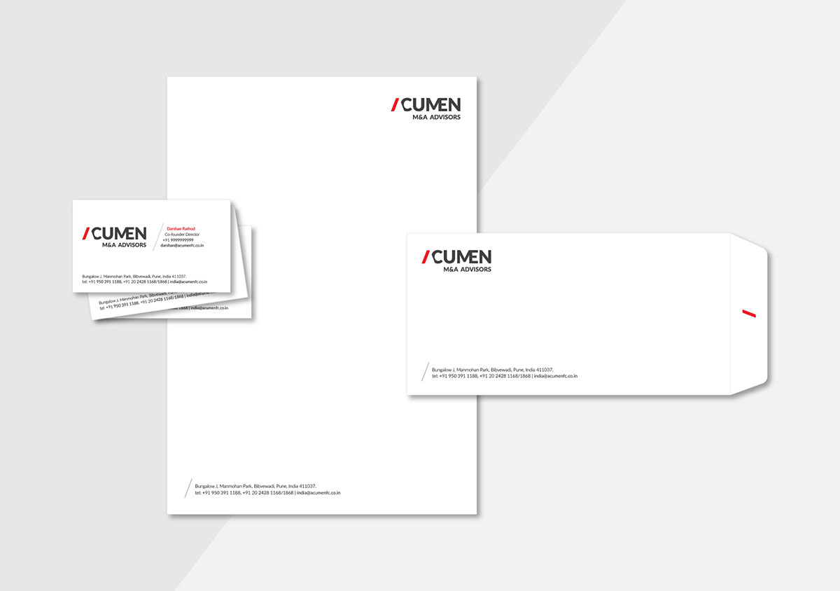
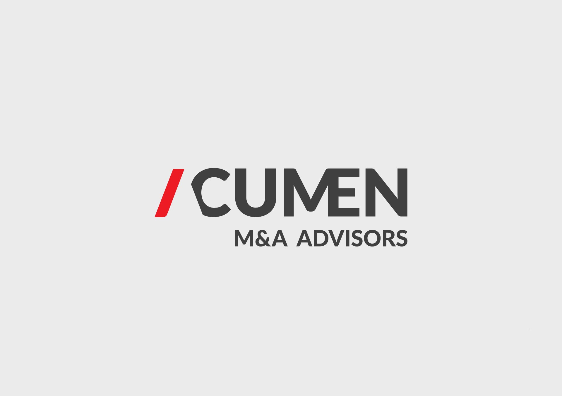
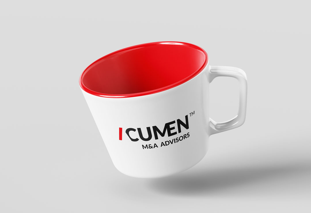
Acumen, a specialized firm offering expert advisory services for mergers and acquisitions (M&A) transactions, now boasts a meticulously designed logo that precisely embodies their focus. Through clever use of typography we transformed the letters 'A' and 'C' that represented "acquisition" and 'M' and 'E' that symbolized "merger" to seamlessly align the logo with their business domain. Our thoughtfully crafted logo encapsulates the essence of Acumen's services, imparting depth and significance to their name for target clients. The red accent on the letter ‘A' adds a touch of modernity, along with retaining it's corporate identity and reflecting Acumen's contemporary approach. The result is a visually compelling and meaningful logo, elevating Acumen's brand identity and communicating their expertise in the M&A realm effectively.