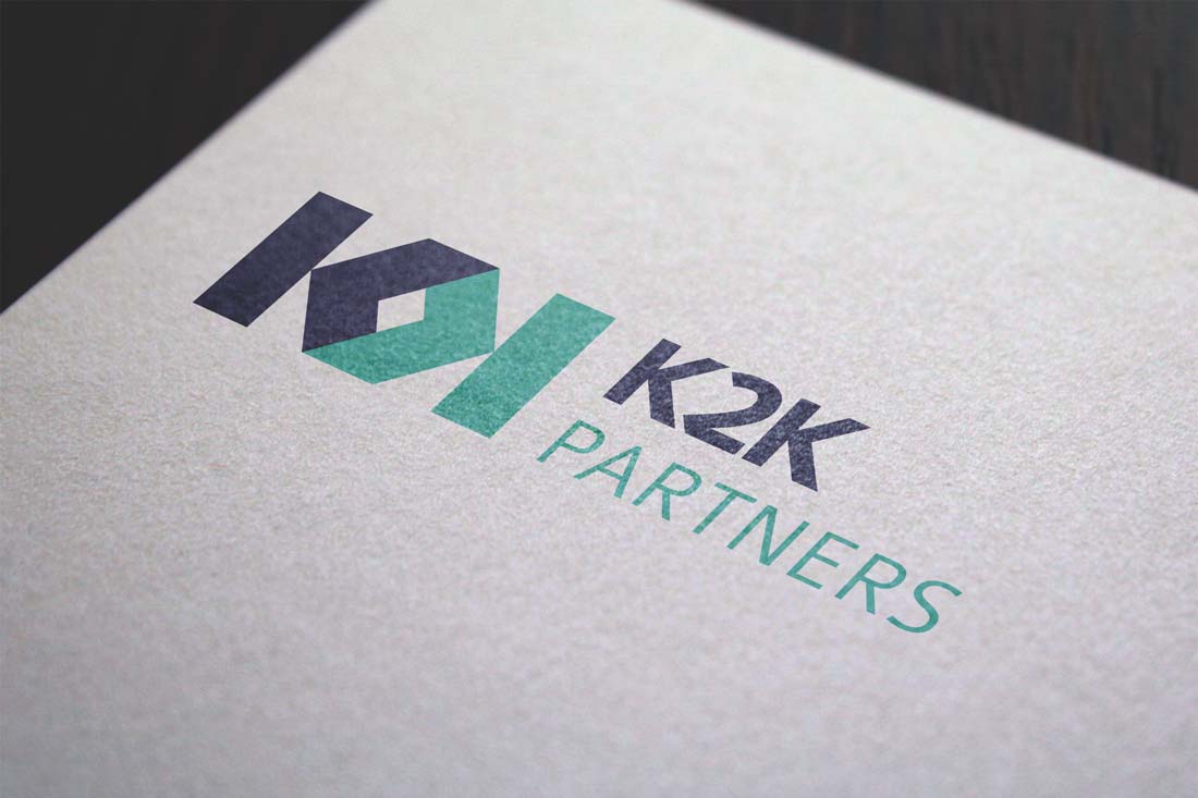
In the crafting of the K2K Partners logo, we ventured into a captivating fusion of design and symbolism. The intertwining letters K, emblematic of K2K, undergo a compelling transformation as they stand side by side. A deft flip of one K results in the formation of a commanding hexagon, where the convergence of the two Ks creates an intriguing interplay of angles.
This hexagonal structure carries a profound significance, reminiscent of the robust and interconnected beehive structures found in nature. Much like the strength derived from each side seamlessly connecting to the other in a beehive, our design underscores the structural integrity and resilience essential to the real estate realm that K2K Partners navigates.
This emblem stands not just as a visual representation but as a testament to the enduring strength and interconnectedness that defines both nature's finest creations and K2K's role in the real estate space.