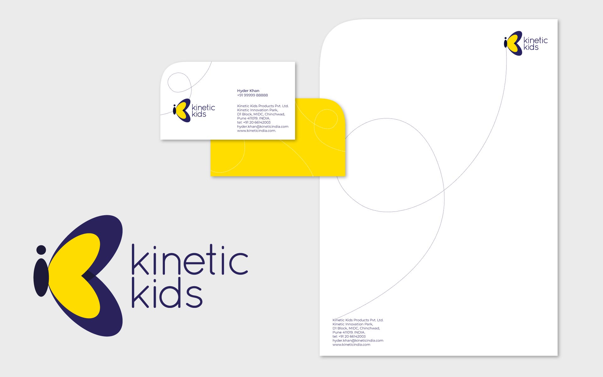
When Kinetic Kids approached us, they sought a logo and stationary design that truly embodied their product – Baby Strollers. As a venture under the esteemed PLC parent company, Kinetic Engineering Ltd., they desired a professional standard that aligned with their brand. The logo we crafted features a butterfly, with its body resembling a baby, and the wings forming two 'K's, symbolizing a butterfly in motion. The butterfly also evokes a soft and caring feeling suggesting that babies need to be handled with care. The chosen colors strike a balance between being corporate and playful. To maintain a unique design element, we incorporated the trail of a butterfly, representing a stroller, throughout the stationary. The resulting branding captures the essence of Kinetic Kids and their commitment to offering high-quality strollers for babies.