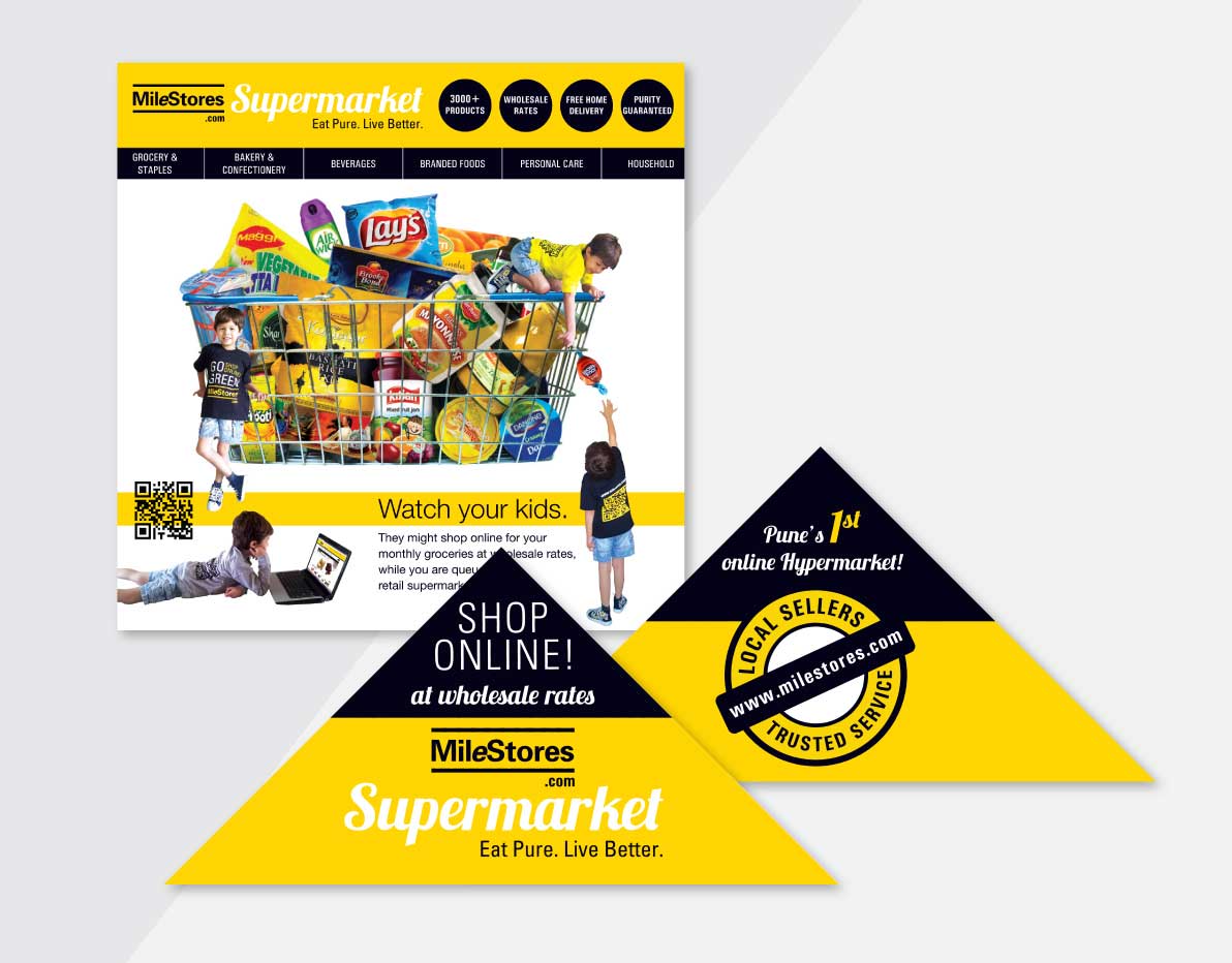
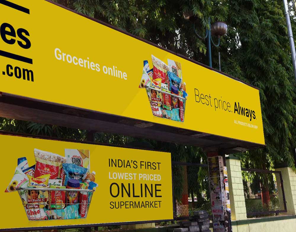
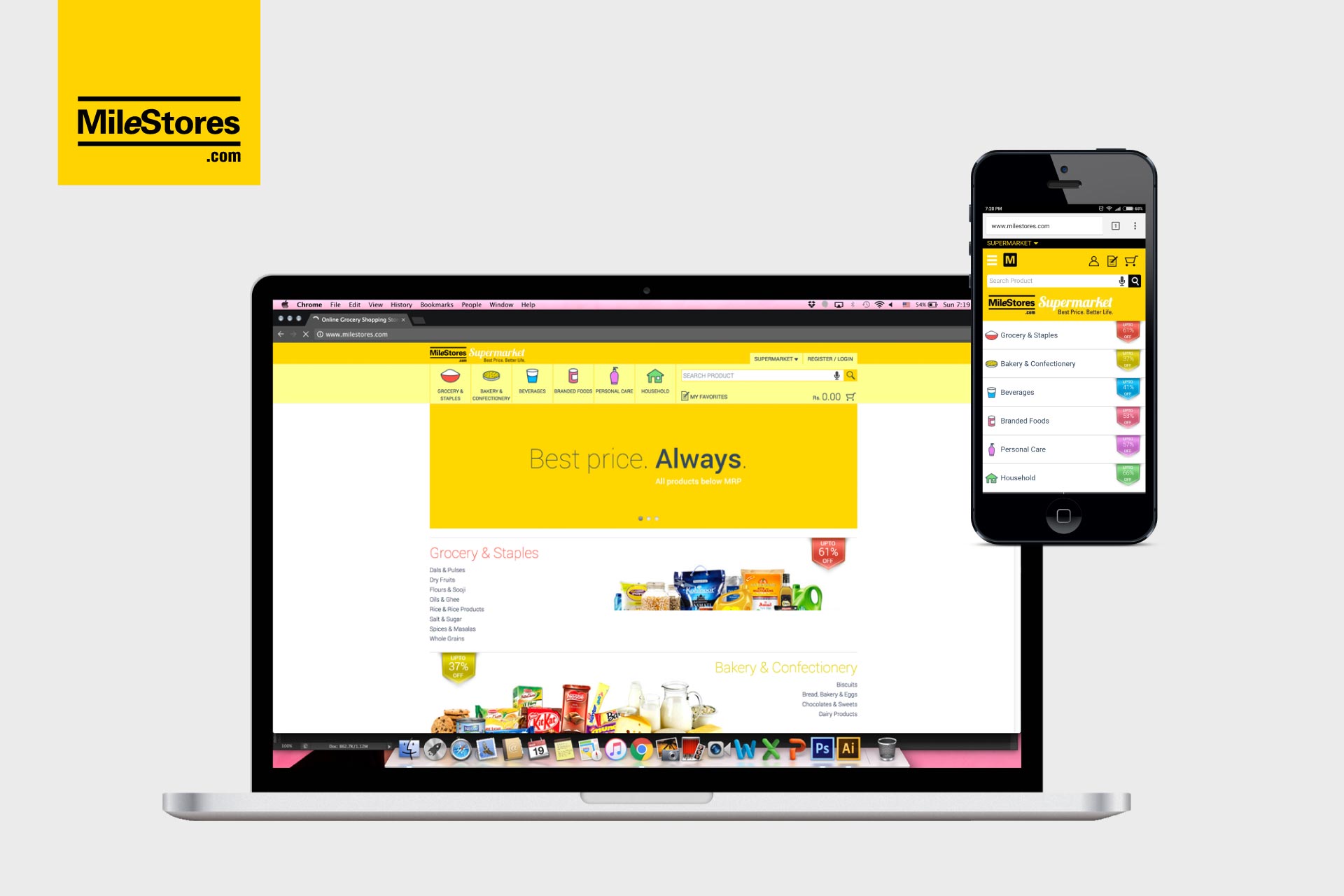
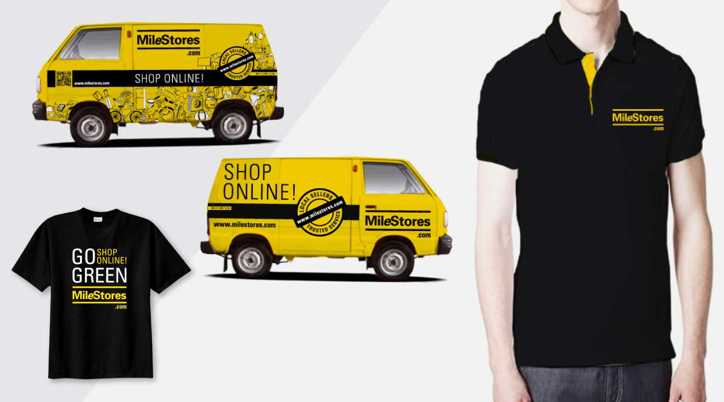
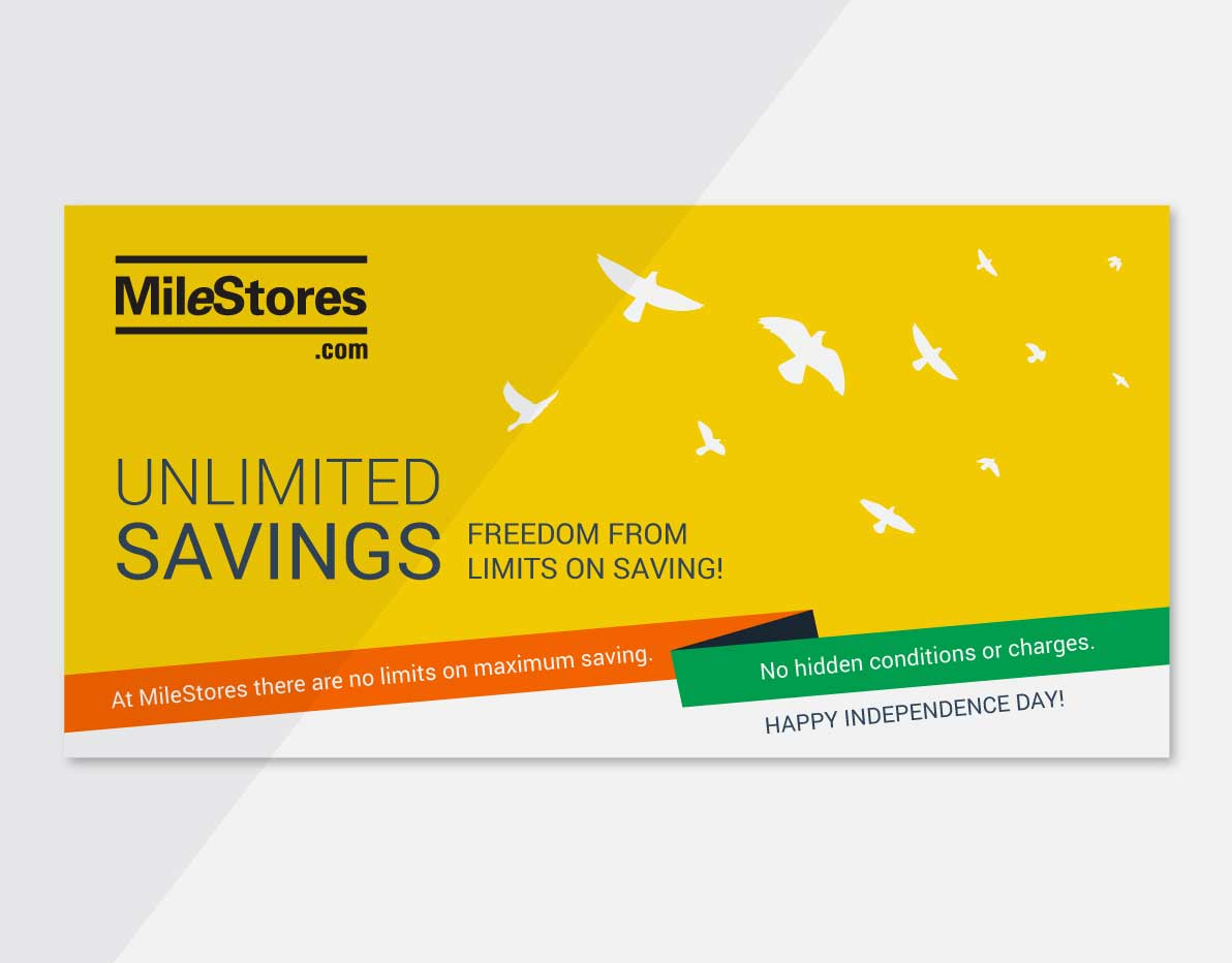
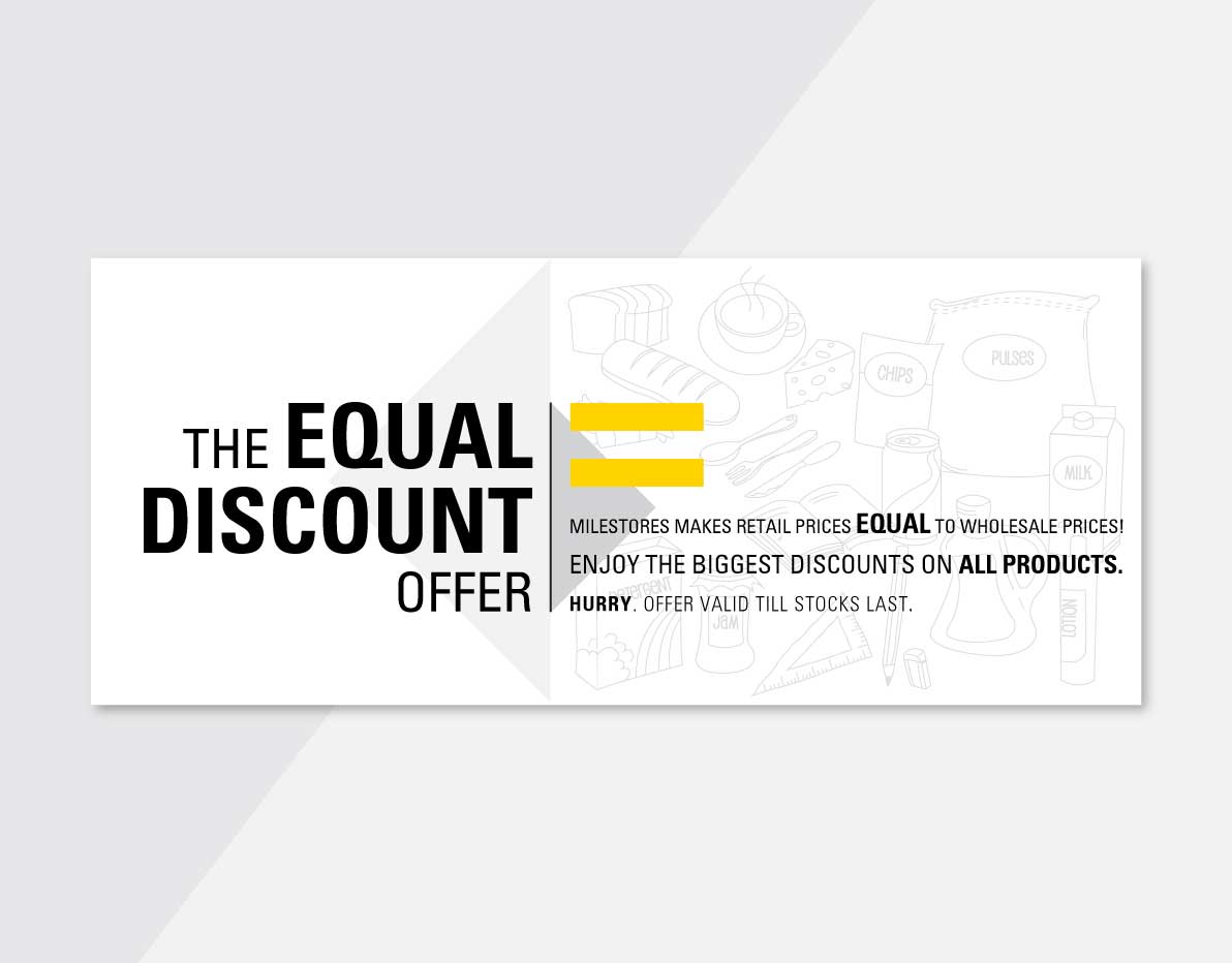
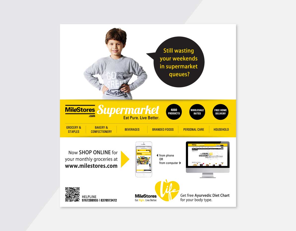
This innovative e-commerce brand demanded a simple and consistent design language. For the logo, we opted for a clean sans-serif typeface to ensure clarity, with the ‘e' highlighted in italics, symbolizing its connection to 'eCommerce'. A clean and user friendly Commerce website was developed that not only worked well for the brands it showcased but also aided an easy shopping experience for its customers. Other marketing collaterals like leaflets, newspaper inserts, bus shelters, hoardings, van wraps, etc., were meticulously crafted. The strategic use of the colour yellow played a crucial role in holding the viewer's attention while maintaining a high contrast to emphasize essential information. Innovatively, we designed triangular newspaper inserts that cleverly held the corner of a page, preventing them from getting lost before reaching the reader, thereby enhancing visibility and ensuring engagement. Overall a cohesive and impactful brand identity was formed that resonated with the audience and effectively conveyed the essence of the eCommerce venture - Milestores.