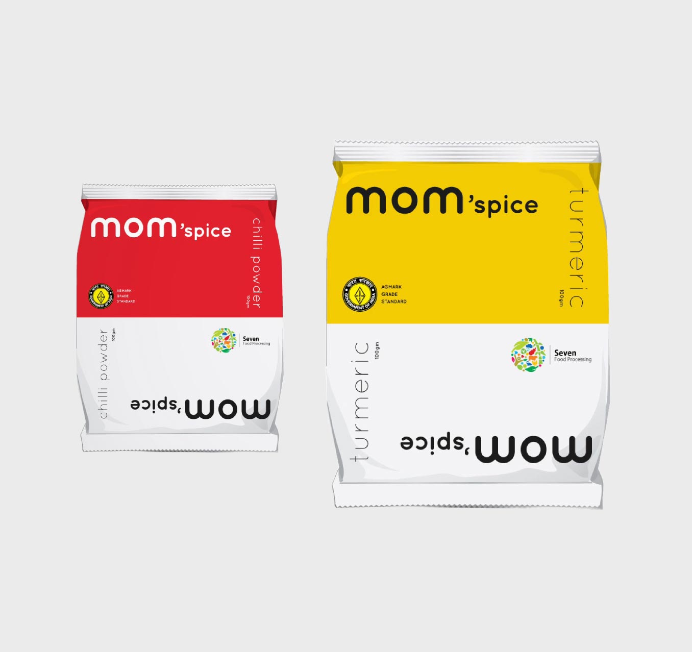
Drawing inspiration from the nostalgia, love, and comforting essence of Indian food culture, we crafted an organic spice brand called Mom'spice. The clever use of an apostrophe in the name emphasizes the trust associated with a mother's choice of spices for her cooking. The logo, featuring a soft rounded sans serif font, elegantly spells out both 'mom' and 'wow' ensuring a heartwarming and trustworthy connection. We embraced simplicity and clarity in our packaging design, utilizing solid colors and clean type, conveying an appealing aesthetic. Each spice is color-coded, creating a clutter-free shopping experience that resonates with consumers. Mom'spice cherishes the joy of home-cooked meals, bringing cherished memories to every kitchen shelf.