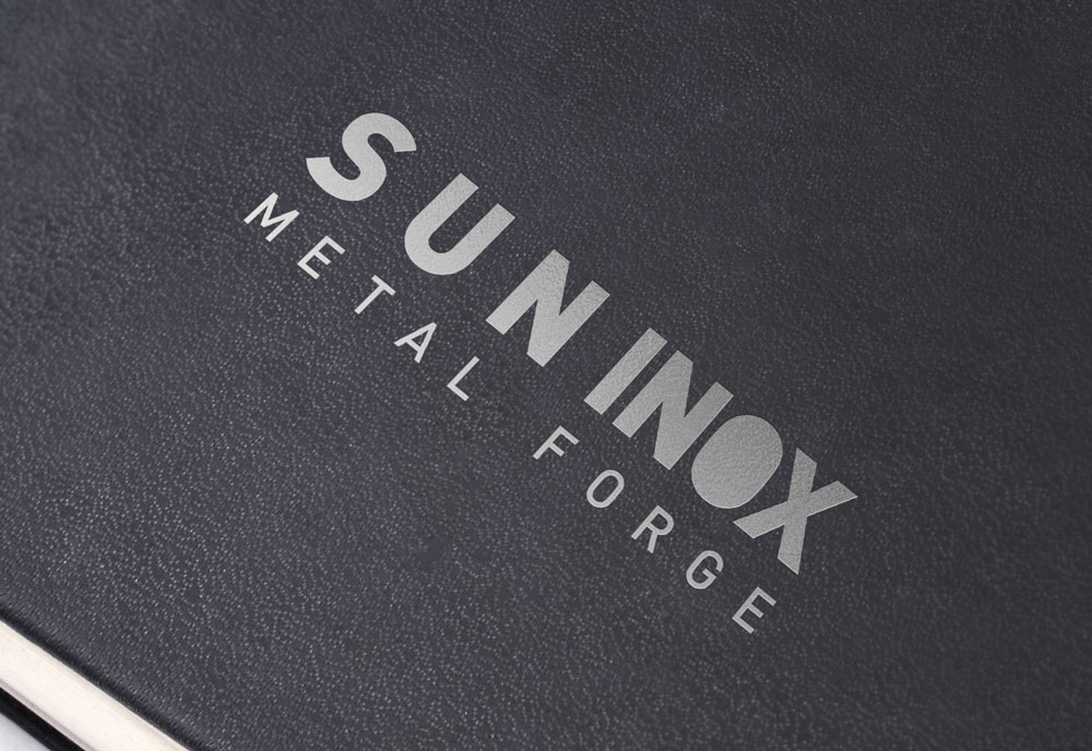
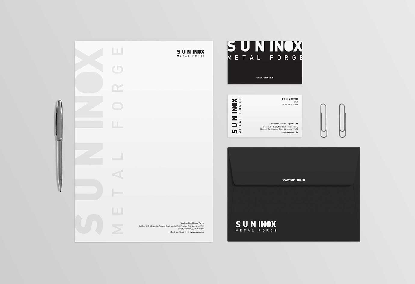
As a forging company, the primary task is to compress raw metals and transform them into useful shapes and products for further use. This process was creatively highlighted in the logo we designed. The word "SUN" was spaced out, and "INOX" was compressed, symbolizing the journey of forging. Notably, the 'O' in "INOX" did not have a counter form, emphasizing its compressed nature. The choice of silver color in the logo reinstated the metal industry, making it unique and representative of the company's core expertise. The silver hue conveys a sense of sophistication and modernity, reflecting the company's commitment to cutting-edge forging techniques. For the stationery, we opted for a clean and corporate look, using white and black. This choice maintains a professional and minimalist aesthetic, ensuring a consistent and cohesive brand identity.