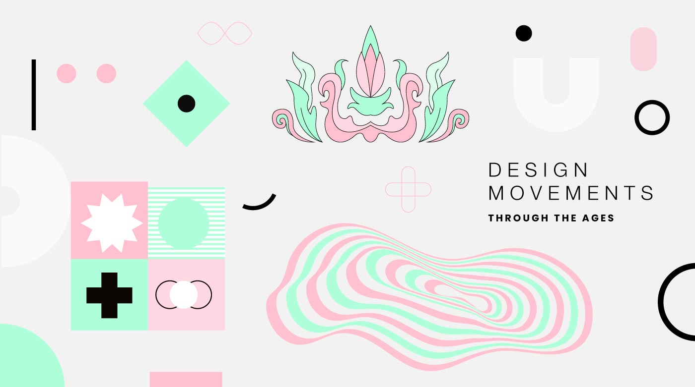
Designing with History: How Classic Design Movements Shape Modern Branding
Every era in art and design leaves behind a language, a visual vocabulary that continues to shape how we communicate. At StudioD, we draw inspiration from these timeless movements, reinterpreting them for modern branding. Here's how some iconic design styles live on in the brand worlds we've crafted.
1. Bauhaus – Function Meets Form
The Bauhaus movement (1919–1933) was defined by simplicity, geometry, and functionality. Clean forms, bold colors, and efficiency in design made it revolutionary.
StudioD Example: Value Mandi (A Tata Enterprise)
With its bold yellow circle, sharp geometric elements, and functional clarity, the Value Mandi identity captures the Bauhaus spirit. But it doesn't stop at the logo, the brand language extends into a modular grid system, strong typographic layouts, and a direct visual voice. Utility and aesthetics work hand-in-hand across environments and communication, just as Bauhaus intended.
2. Art Nouveau – Organic Elegance
Art Nouveau (late 19th – early 20th century) embraced elegance inspired by nature. Flowing lines, floral motifs, and ornate details made everyday design feel artistic and ornamental.
StudioD Example: Sajawat Living
The Sajawat Living identity explores the form of a peacock, a timeless symbol of beauty, grace, and ornamentation. Its design language carries this further, with fluid lines, nature-inspired palettes, and ornamental detailing across interiors and brand communication. Just as Art Nouveau blurred art and function, Sajawat transforms branding into something graceful, organic, and elevated.
3. Psychedelic – Freedom & Experimentation
Born in the 1960s counterculture, psychedelic design is loud, free-flowing, and mind-bending. Distorted typography, vivid gradients, and hypnotic patterns defined this era of experimentation.
StudioD Example: Flow Academy
Flow Academy's vibrant and playful identity carries that same sense of freedom and exploration. Its dynamic brand style, with lively colors, expressive shapes, and fluid compositions, channels psychedelic energy across print, digital, and space. The brand speaks a visual language that is unafraid, experimental, and deeply expressive.
4. Swiss Style – Precision & Clarity
The Swiss Style (or International Typographic Style, 1950s) is all about order, grids, and legibility. It relies on clean typography, minimal decoration, and functional layouts to communicate with precision.
StudioD Example: Acumen M&A Advisors
The Acumen M&A brand identity embodies Swiss clarity. Structured, balanced, and direct, it avoids ornamentation and instead uses grids, whitespace, and typography as its strongest assets. From its logo to reports, decks, and communication, the brand language reflects authority and trust, hallmarks of the Swiss style.
5. Minimalism – Less, but Better
Minimalism emerged mid-20th century as a philosophy of reduction. Stripping away excess, it focuses on clarity, negative space, and essential form.
StudioD Example: Jay Traders
The Jay Traders identity embraces minimalism at every level. Its restrained logo is matched by a pared-down palette, uncluttered layouts, and considered typography. The brand language thrives on simplicity and smart use of space, showing how “less” can truly communicate more.
Why This Matters for Branding
Design movements are more than history lessons, they're living philosophies that help brands express who they are. At StudioD, we don't just design logos; we craft brand languages. Whether it's Bauhaus geometry, Art Nouveau elegance, or Minimalist restraint, these timeless approaches shape environments, communication, and experience.